Ride Society Street Supply Co · San Diego CA · Issue 001 · Free / Invite
00010203040506
DROP 001
WATCHINGXFELONIOUS
The drop, the design, and why it looks like this. A magazine, because the design is the point.
RS // DROP001 // WATCHING X FELONIOUS // SAN DIEGO CA // YOU SHOULD BE WATCHING // CODES COME FROM PEOPLE. //RS // DROP001 // WATCHING X FELONIOUS // SAN DIEGO CA // YOU SHOULD BE WATCHING // CODES COME FROM PEOPLE. //
DROP001: WATCHING X FELONIOUSFrom San Diego. For everyone.
00A
00A · Choose your experience
THIS ISSUE RUNS IN YOUR COLOR.
Pick a swatch. The HYPERCUSTOM graphics in this magazine follow it.
Every drop ships the same skeleton. The Signature line is one statement design with colors picked for us, by us, and it dies with the drop. The HYPERCUSTOM line is staple silhouettes in a ten color palette where you pick the accent and the design language stays ours.
ONE SKELETON // TWO LINES // REPEATS EVERY DROP // ONE SKELETON // TWO LINES // REPEATS EVERY DROP //ONE SKELETON // TWO LINES // REPEATS EVERY DROP // ONE SKELETON // TWO LINES // REPEATS EVERY DROP //
The shape of a dropRepeats every drop
02
02 · One design, every rider
EVERY COLOR WE RUN.
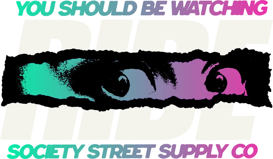
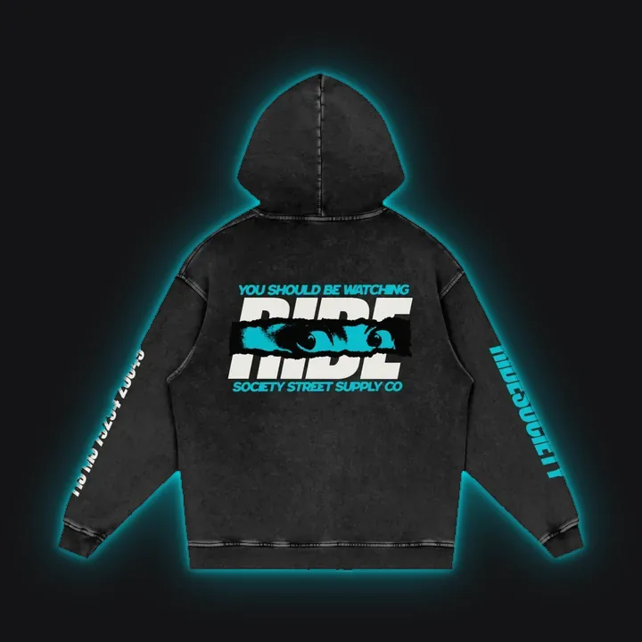
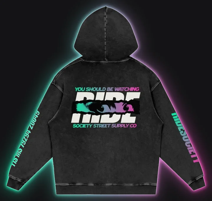
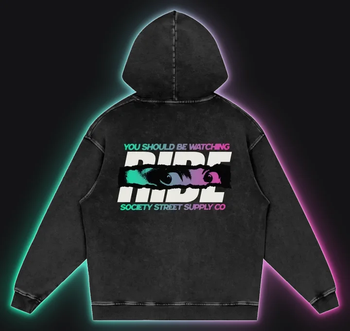
The Watching back panel in every colorway we cut: ten solids, the gradient, and the Signature print at the end of the row. Same art, different accent. Tap any frame for the big one.
12 back panelsSame art, different accent
03
03 · What we pull from
GRIT UNDER THE GLOW.
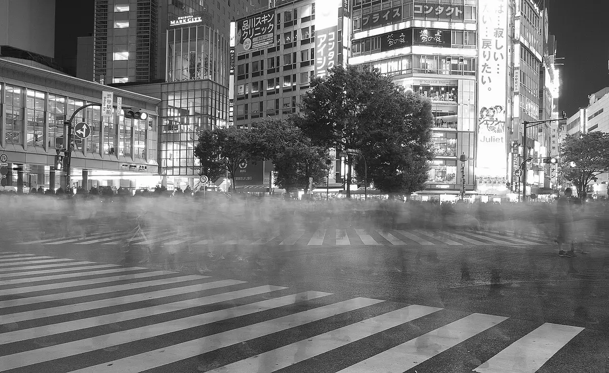
Zenless Zone Zero. Persona. Shibuya after midnight. The thread is street neon: signs buzzing over wet asphalt, color that cuts through grime instead of decorating it. That's the world this drop is drawn from.
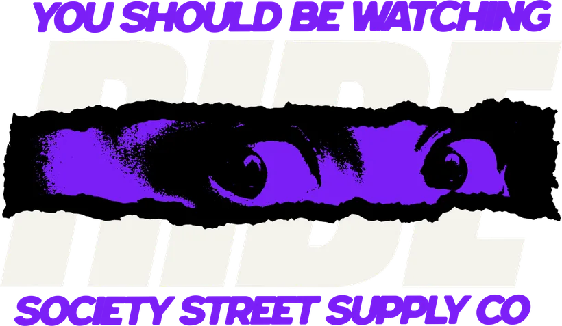
So the pages stay dark and a little dirty on purpose. Print texture, halftone, a torn band pasted over the back panel, and one line of neon doing the cutting. Gritty first, glow second.
03A
RS DuskRim traced
03B
RS CoveRim traced
03C
SS001Dual rim
Photo: Micael Widell · CC BY 3.0Street neon
04
04 · The graphics
THE GRAPHICS.
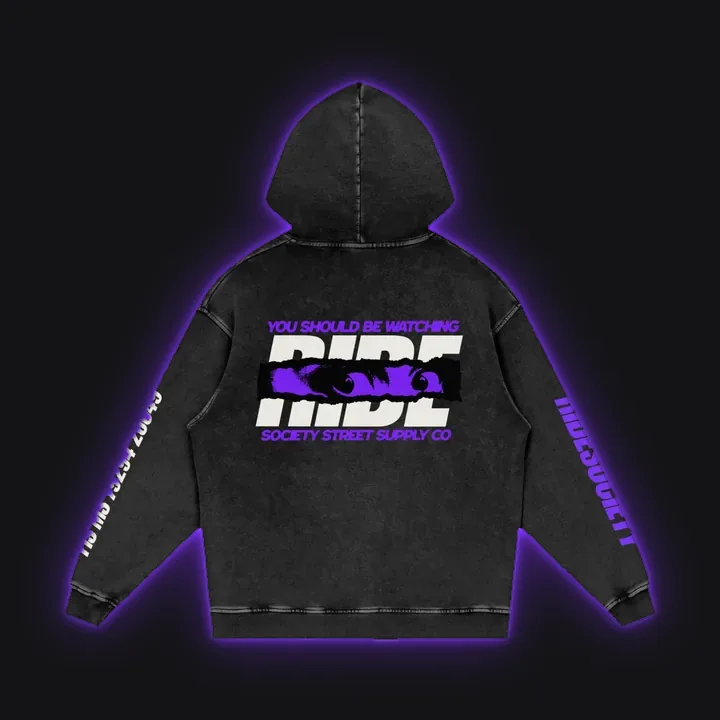
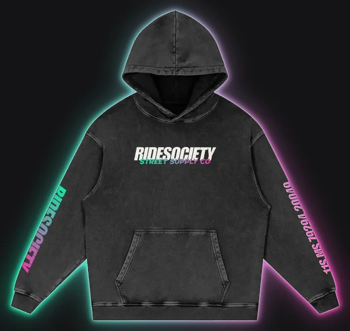
Shot at 4200px, 300dpi, printed panel by panel. The left sleeve never changes: MGRS 11S MS 79294 20049, the San Diego spot where the first ride met. New this pass: the RIDESOCIETY sleeve prints in the signature gradient on every colorway, and the MGRS arm prints white.
04A
Back · the centerpieceRS Dusk
04B
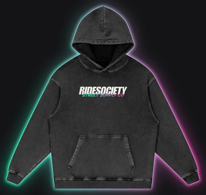
Front
04C
R sleeveSig gradient
04D
L sleeveMGRS · white
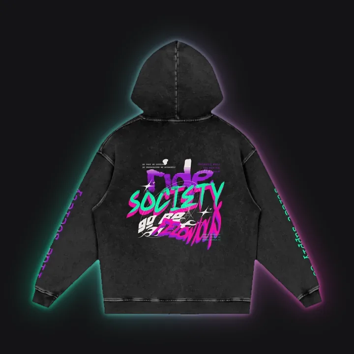
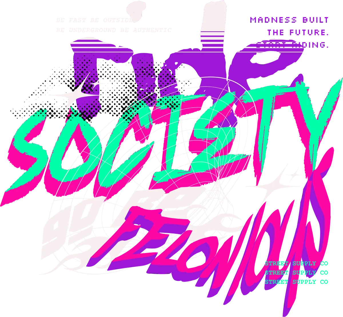
SS001 Felonious · panel art · dies with the drop
04E
BackSS001
04F
FrontSS001
04G
R sleeveSS001
The graphics4200px / 300dpi
05
05 · The eleventh
THE ELEVENTH.
The Signature line dies with the drop. Its palette moves in here: mint into pink on the Watching panel, sold as HYPERCUSTOM.
The eleventh colorway, and it leads the picker: the only gradient in a row of solids, and the only one that had a life before it. Wear the drop after the drop.